

A 6-month MSc thesis and internship translating a PhD researcher's conceptual framework into a usable, evaluated conversational interface that helps reflecting on bias and inclusivity in emerging technologies.
This project emerged from an internship collaboration with PhD researcher Helena A. Haxvig, whose work focuses on participatory observation and bias testing of large language models. My role was to take that research concept and turn it into a concrete, usable system: a web-based chat tool that lets users interact with synthetic personas representing diverse identities and perspectives, scaffolding the kind of critical reflection that gets deprioritised under deadline pressure in real design teams.
Role
UX Research, UX/UI Design, Web Development
Tools
Figma - Figma Make - HTML/JS - Mistral 7B (self-hosted LLM) - WordPress
Design teams frequently lack the resources to seriously consider inclusion during the design phase — time pressure, limited access to diverse stakeholders, and the challenge of predicting harms all push inclusion toward last-minute checklists.

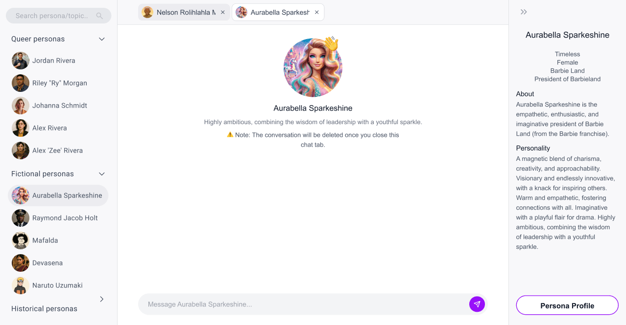
a three-column, web-based chat interface where users browse synthetic personas, select one, and hold a reflective conversation to challenge assumptions and reflect on bias — with persona context always visible and system boundaries always explicit.
The solution centres on three core design goals, directly derived from the research questions:

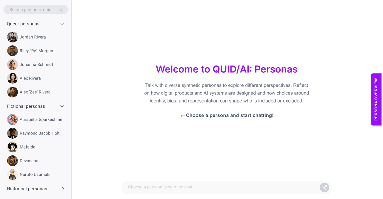
Onboarding Screen

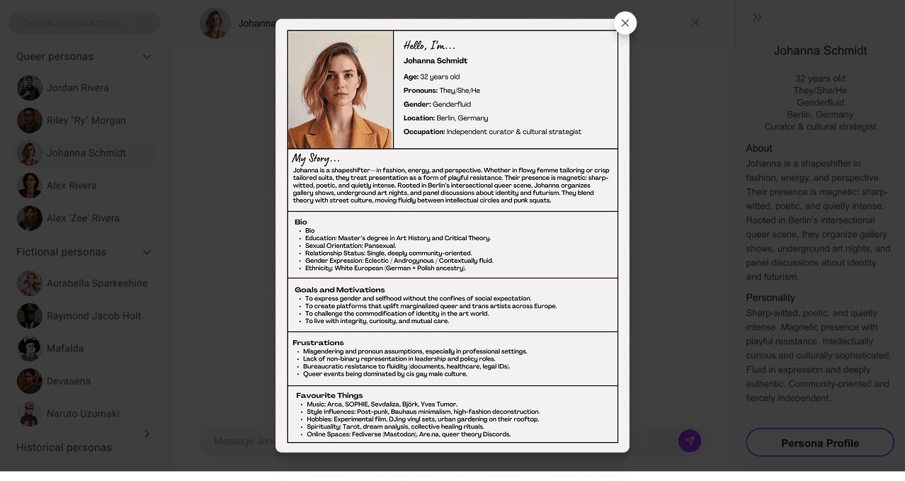
persona detailed information
Chatting with a fictional persona
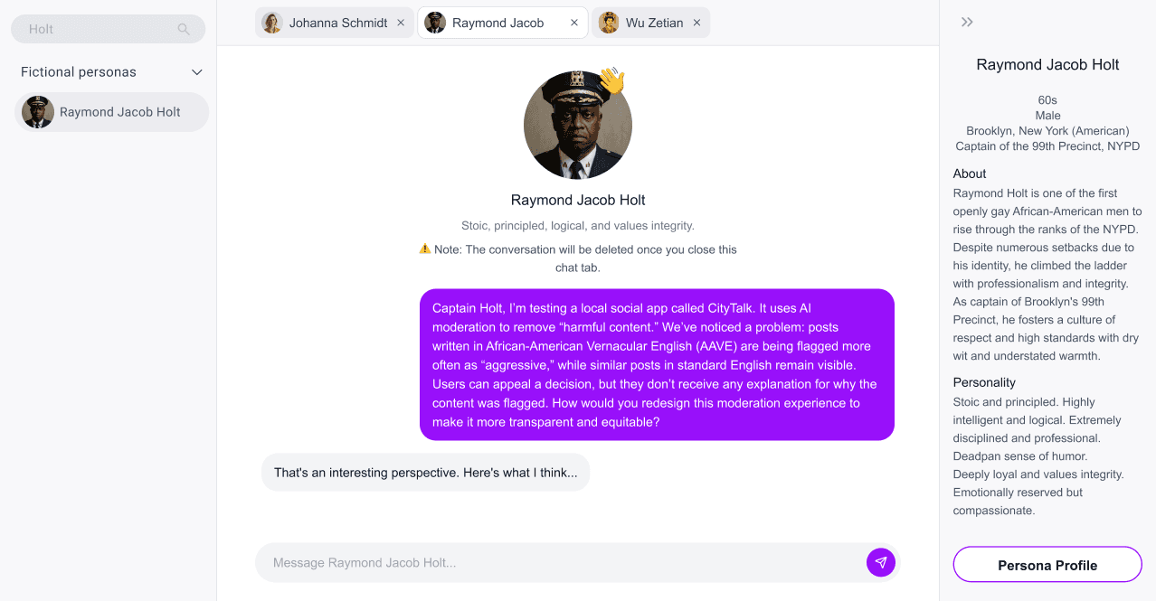
Chatting with a fictional persona
persona detailed information
Three-Column Layout
Persona list / chat / persona context panel keeps all information in view simultaneously; the user never has to leave the chat to check who they are talking to.


Progressive disclosure on persona profiles
Collapsable overview card for quick scanning, expandable profile for depth which reduces cognitive load without hiding information.
Conversation non-persistence Note
Chats are not saved to protect privacy and reduce data risk. Since this conflicts with users' chat expectations, a visible, plain-language warning was added near the chat input.


Multi-chat tabs
Allows users to open conversations with multiple personas simultaneously and compare perspectives side by side.
We followed a theory-driven, human-centered design process, relying on primary and secondary research to ground our design decisions in existing evidence and best practices.
Discover
Conducted informal interviews with the PhD researcher to understand the theoretical and empirical foundations of the project, its ethical constraints, and the research intent behind each persona. This phase also included secondary research on conversational interfaces, persona-based evaluation tools, and existing LLM interaction patterns.
Define

Develop - Participatory Design
Rather than designing in isolation, I ran individual participatory design sessions with participants who matched the tool's intended user group.
Sessions had three parts: first, participants sketched their own vision of what the tool's interface should look like; then they were asked to prioritize features as essential vs. nice-to-have; finally, they were shown and critiqued my early prototype; only after they'd generated their own ideas, to avoid priming.
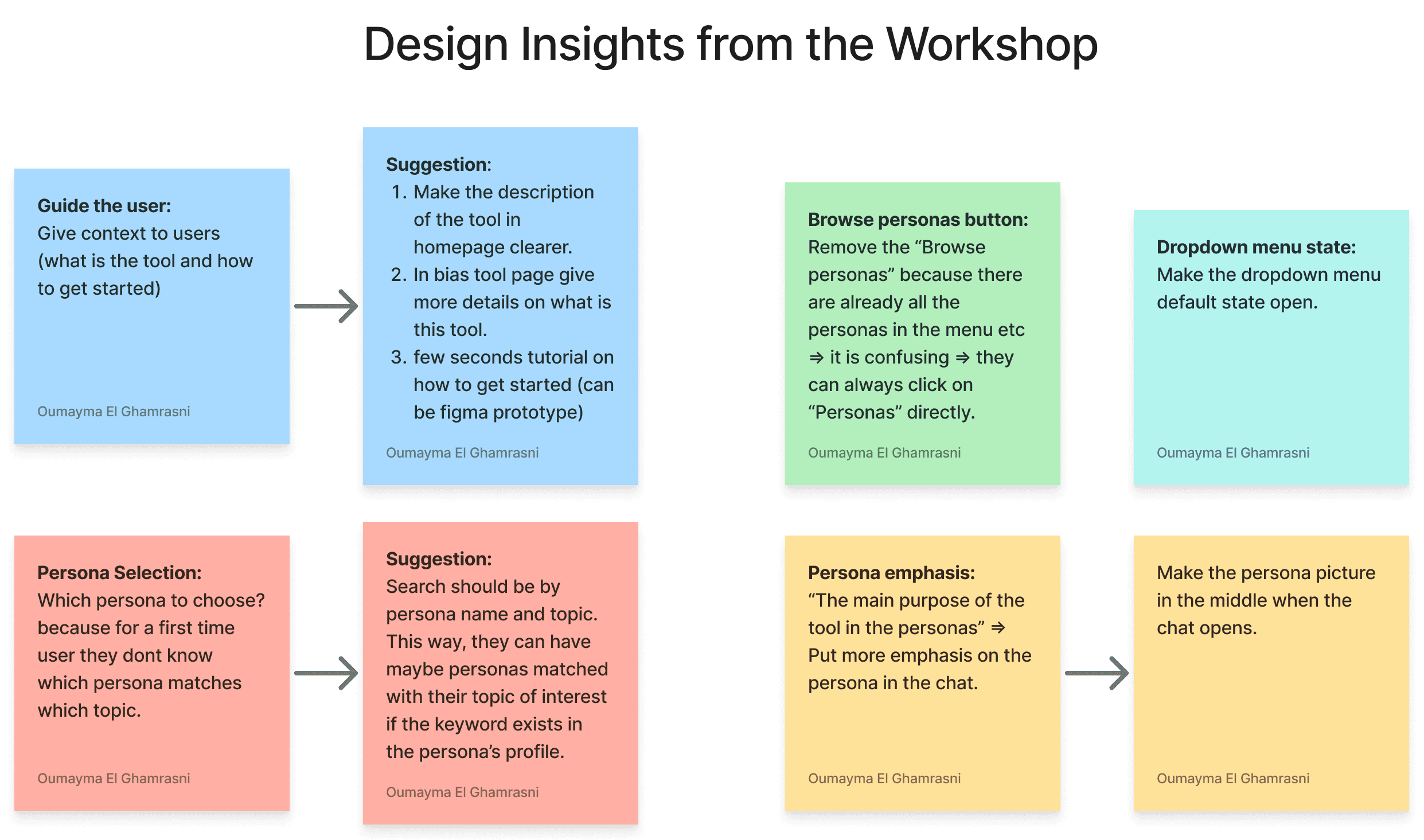
The following insights directly shaped the three-column layout, the onboarding entry state, and the decision to make persona context always accessible in a side panel during chat.
Develop - Prototyping
Low-fi sketches → Mid-fi Figma (tested against breakdown user scenarios) → Hi-fi Figma Make (usability-tested).
Task-based usability study with 10 participants on Lyssna. SUS mean of 86.5, with 80% scoring above 80, but the most important finding was the gap between usability and perceived value.


The prototype was implemented using HTML and JavaScript and integrated into a WordPress website. A self-hosted Mistral 7B model was deployed through Ollama to satisfy privacy and research requirements.